
What colors have you chosen for your marketing materials? What were your reasons for making that particular choice? Was it because you liked those particular colors, or did you have a particular marketing message in mind? While visual appeal is an important consideration, there is more to color choice than what looks good. You need to consider the psychology of color when designing your marketing materials – be it business card, brochure, web site, emails, posters or other materials.
It has been documented that different colors actually send specific signals to our brains subconsciously influencing our behavior. We recently saw a marketing statistic that claims that 62-90% of our feeling about a product is determined by color alone. That makes the colors you choose to use as important, or more important, as the words and images you choose.
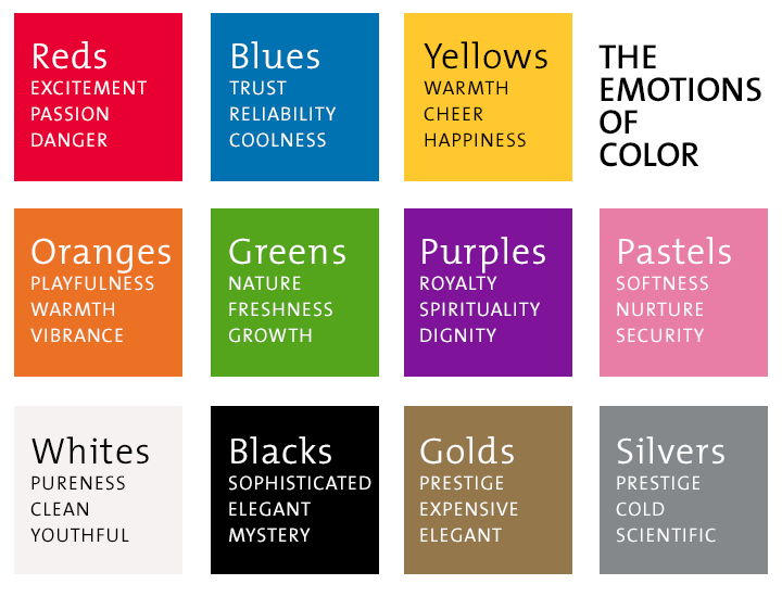
The emotional side of color
Though colors can evoke different emotions in different cultures, in the North American mainstream culture the following colors are associated with these qualities or emotions:
Market researchers have also determined that color affects shopping habits. Impulse shoppers respond best to red-orange, black and royal blue. Those who plan and stick to budgets respond best to pink, teal, light blue and navy and traditionalists respond to pastels.
Give serious thought to the message you want to convey and to the psychology of the recipient. Then choose your colors accordingly.