CLIENT OVERVIEW
MMi Creative was employed to design corporate look and presence for Phenix Cabinet’s new line of “off the shelf” cabinetry – Gran Manor – that was going to be test marketed in selected Lowe’s home improvement stores in the southeast US. This was a line of higher end construction and finish cabinetry than what was currently being offered in Lowe’s stores.
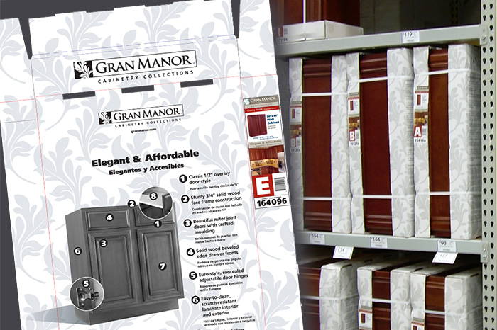
We started with the design of the Gran Manor product logo and a color system to maintain consistency across pieces and media. We also decided to use the campus leaf motif in the logo as an uniting pattern in packaging and collateral.
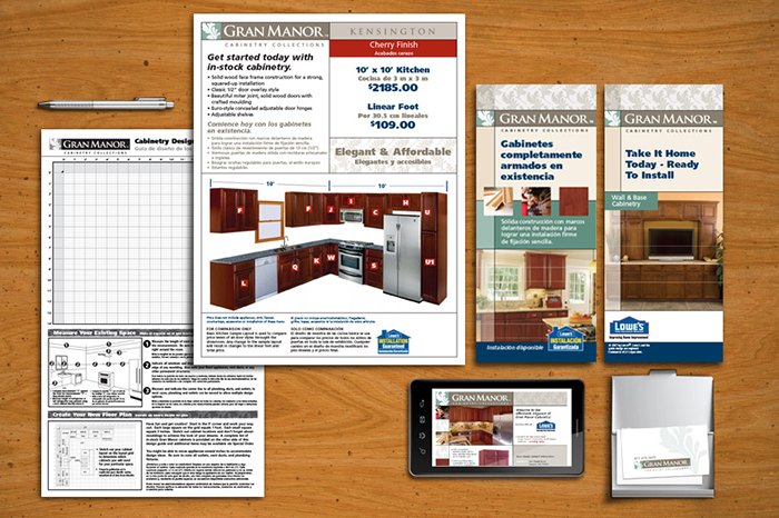
One of our main challenges from the manufacture was to design cost-efficient packaging that both protected the product and still connoted the upscale elegance of cabinets. We also needed to conform our packaging designs and supporting product collateral with Lowe’s display standards.
Gran Manor cabinets were successfully sold and marketing in Lowe’s stores for approximately a year until the parent company, who’s main line of revenue was custom cabinetry to home builders, went out of business during the housing crisis of 2009/2010.
SCOPE OF WORK

BRAND LOGO
We initially presented a number of design styles and ideas to the client for consideration.

One of the initial designs was selected without further revision. We added the phrase “CABINETRY COLLECTION” under the bar-style logo. The stylized acanthus leaf motif, reminiscent of fine carved furniture, was chosen to convey the furniture quality of the product. We then developed a full color version and single color versions for versatility and various usages.

COLOR SYSTEMS
A brand color system was implemented for brand continuity. Plus a complimentary 2-color code system for the cabinet finishes was developed for ease of in-store product selection.


