
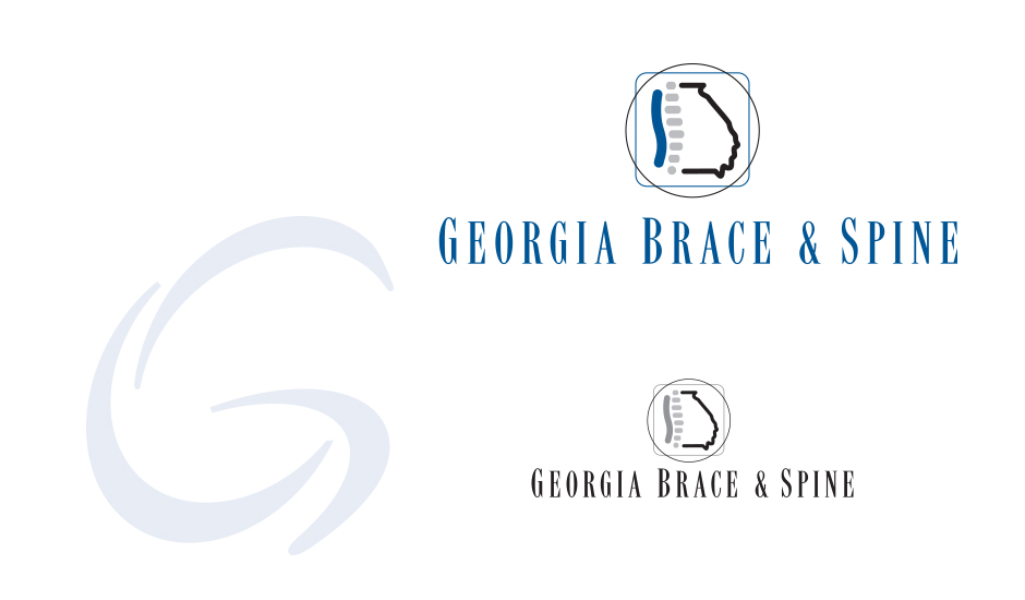
Project Description
Client: GEORGIA BRACE & SPINE
Business: ORTHOTIC BRACES
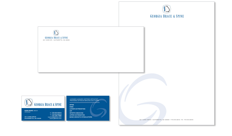
MMi was hired to design a brand look for a company that designs and custom fits orthotic back braces. The logo incorporates the outline of the state of Georgia with a stylized spine as the left side of the outline. A serif font was selected for its traditional appeal.
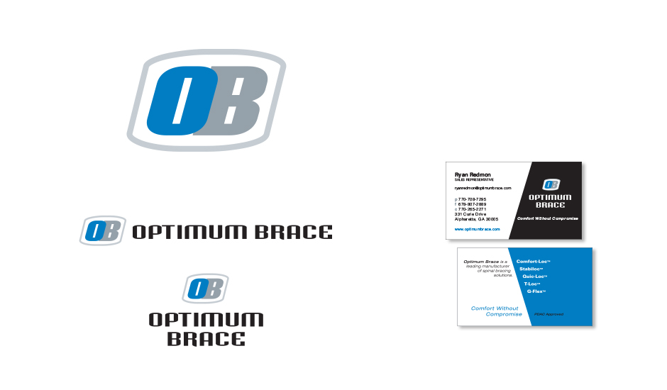
Two sub-brand marks/logos were later designed for the company’s two lines of back braces.
“G-Brace” is the company’s main line of braces. G-Brace’s stylized “G” mark is used in conjunction with the corporate branding.
“Optimum Brace” is a specialized line of back braces for sports injuries. The company requested a separate, sportier branding look for this brace sub-brand along separate collateral for the sales force.