
Project Description
Client: UXC
Business: NUCLEAR FUEL CYCLE MARKET CONSULTING FIRM
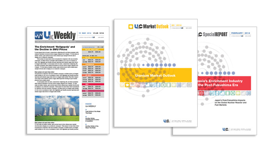
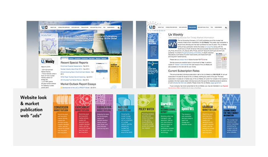
To mark their 20th anniversary, long-time client UXC (formerly Ux Consulting), commissioned us to update their corporate identity. This project included redesigning their logo, collateral, publications, and website look.
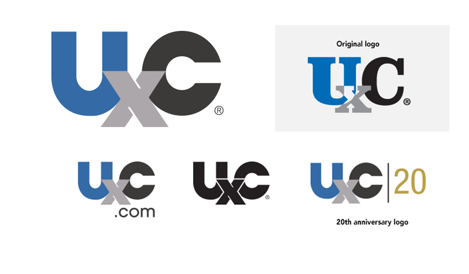
The logo kept its familiar “UXC” configuration with the lowered “X” but the serif characters ere changed to a modern, stronger-looking sans-serif style. the three logo colors ere also kept but adjusted in their shading.
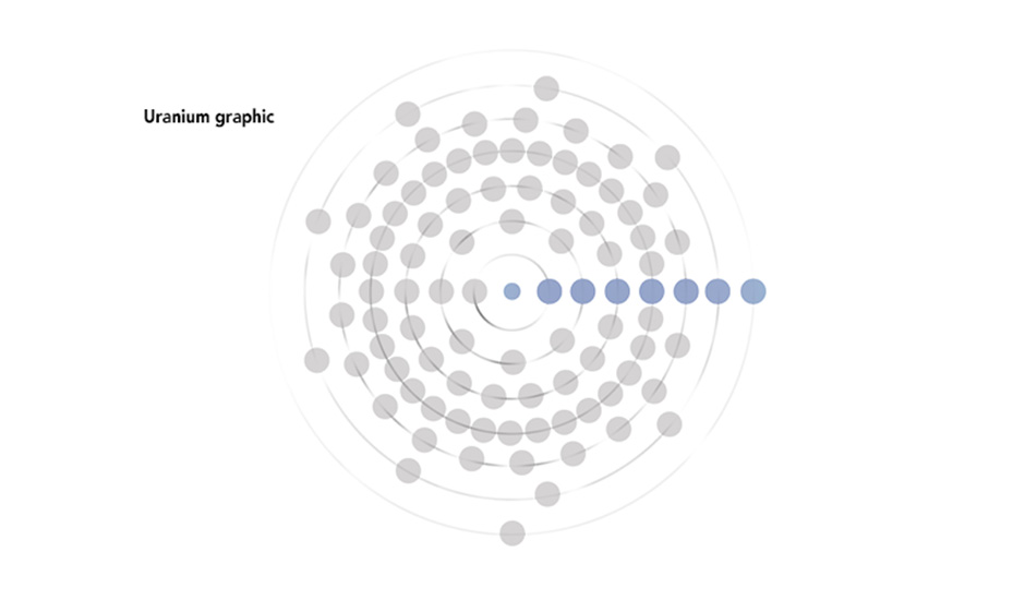
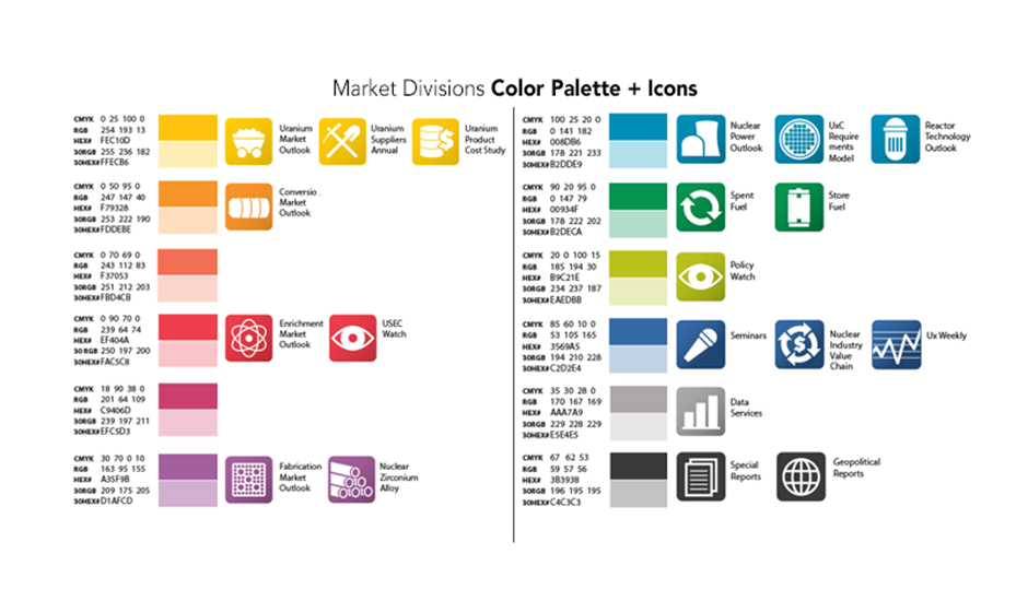
The circle uranium graphic, used as a submark on many of UXC’s publications and collateral, was flattened and streamlined in its styling. A comprehensive color system and corresponding icons were designed to represent and easily identify the various nuclear fuel market segments that the company serves.