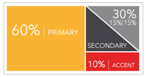
Choosing color. Using the 60-30-10 rule.
Deciding how to effectively use color in print projects, emailings and websites can be a daunting job. When applying a color scheme for just about any design project, it helps to start by applying a tried-and-true design principle: the 60-30-10 Rule. The basics of the 60-30-10 Rule is to choose a primary color that dominates 60% of the area; a secondary color to compromise about 30% of the visual field; and an accent color that provides a 10% color pop.
To visualize this 60-30-10 in use, think of a man in a business suit: 60% is the slacks and jacket, 30% is the shirt, and 10% is the tie.
The 60-30-10 Rule helps to visually organize color, keeping your design be it print or web, from getting cluttered and confusing with too much color usage. Begin with a 3-color scheme commonly used for your brand. If you have a “signature color” – think Tiffany’s blue, Coca-Cola red, Home Depot orange – use it as one of the three colors. Then decide the percentage usage (primary, secondary and accent) for each of the three colors.
 If you need to add a fourth or fifth color, split either the primary or secondary colors and add a lighter or darker shade of that color to the mix. Just remember to still keep that color split within its designated percentage. For example, if you split your primary color to add a lighter hue, the 60% would change to something like 40% original color plus 20% lighter hue. Resist splitting your accent color as this will dilute the punch you need this color to convey.
So, how do you apply the 60-30-10 Rule to your layouts? Use your primary color (60%) for backgrounds, color blocking and large text areas. Use your secondary color (30%) for headlines, sidebars, highlighting or text callouts. Then use your accent color (10%), typically your boldest color, to guide the reader to take a particular action. Use it for areas you want to draw the eye to such as call-to-action areas, buttons and links.


